
First published in a slightly modified form ‘Branding, to a degree’ in Business Standard, 10 September, in Deep Design, a fortnightly column by Itu Chaudhuri.
In India, the notion of the brand is both nascent and spreading at a gallop. States, NGOs, government bodies, spiritual leaders, cricket teams, and other once-unlikely entities are starting to receive marketing attention, so the brand is never far behind. It’s the new orthodoxy.
University brands, an oxymoron in India until the 1990s, are a fascinating example. They are numerous, often very old, and slow to change, and display, like species, many stages of evolution. This is reflected in their visual identities.
Of course, there’s much more to a brand than the logo, which is only the tip of the brand’s iceberg, so to speak. But it is a tell-tale sign of how an organisation sees itself, and the face it wants to show.
Deep Design reveals the interplay of symbol and reality and the invisible hand of evolution. We shall consider two epochs, the shift (in India) occurring in the late 20th century.
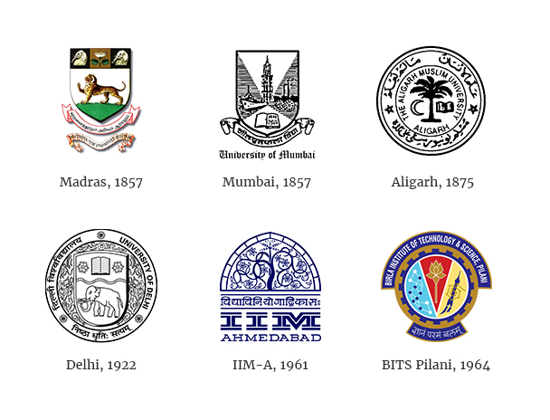
For 150 years, university identities followed an internationally prescribed code. The words seal, insignia or emblem come to mind. A circular typographic arrangement, or the ever-present shield serves as a container. The contents picture symbols of learning, or subjects of study. Shields, divided in a medieval manner, allow a set of images, rather than a unitary symbol.
For 150 years, university identities followed an internationally prescribed code
Like Olympic games symbols up to 1952, they were more traditional than the period warranted, and designed to look like authoritative insignia of learning (with Indian or other local inflections). This applied even when universities displayed modernity in other ways, like architecture. IIM Ahmedabad is housed in a famed modernist masterpiece, but its logo defers to the code: a Mughal arch and tendrils.
Privatisation is the lens through which the evolution of university identity, visual and non-visual is understood. Let’s use 1995 as a convenient year, when the first private university was notified. There are now over 200.
Privatisation is the lens through which the evolution of university identity, visual and non-visual is understood.
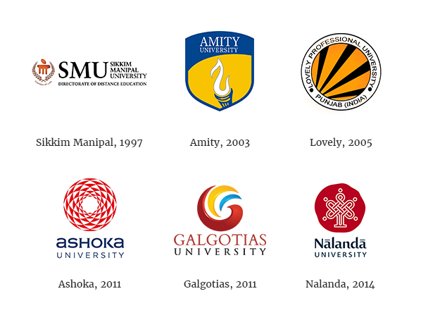
University identities after 1995 are visibly different from their forbears. There’s more variety and individuality, and some modernist simplification. The best attempts look more like modern logos, not insignia. Look, no privatisation! Case solved?
Not entirely. Many, like Amity (a prototypical private university) sport logos that reek strongly of the older code. And even in the previous age, there were privately funded and managed colleges and universities (BITS Pilani, for example). The name Ivy League (ivy climbing up those centuries-old stone walls), brands a club of old, influential universities that retain links to their heritage identities, a code imitated by several US universities.
So are university logos explained as effectively by period (design fashion), and imitation, as by private ownership? To gain more nuance than these hardy perennial explanations provide, we must return to the founding concept of the university, which is the archetypal ideal that we hold in our minds.
The oldest (let’s call them Classical) universities predate modern states though they enjoyed royal and religious support. A community of wise men, either proven or incipient seekers, self-governed, with their own rules, traditions and arcana, and free from excessive oversight. Often monastic in origin and spirit, joined by the pursuit of knowledge, for its own sake.
The oldest universities are often monastic in origin and spirit, joined by the pursuit of knowledge, for its own sake.
Modern states preserved the essentials of this arrangement, even for private universities in the new nation of America. These old universities approximate classical ones (and receive state support with minimal oversight).
The post-private university or PPU (a new phenomenon needs a new label) differs on many of these dimensions. It no longer lurks in the shadows of the state, but feels the harsh glare of competition, not of ideas, but for customers. Global rankings objectivise and hijack the meaning of institutional quality.
The post-private university feels the harsh glare of competition, not of ideas, but for customers.
For the first time, the university must be marketed. It is a product with a proposition for customers (students, donors, and faculty). In many PPUs, students rather than pursuing knowledge for its own sake, are buying a career. ROI calculations are openly made.
Its superboss may be an ‘edupreneur’ who exhorts a Chief Marketing Officer to achieve explicit business objectives. Annual ad spends may top Rs. 50 cr. Crucially, the PPU is managerially run, like a corporation, and thus not entirely collegially governed. (On the plus side, some academic staff may much better paid).
It’s natural then, that the university’s logo needs to maximise visibility, memorability, compactness and attractiveness, that is, more like a modern logo rather than a seal. It is an object of universal, accessible appeal, not a depiction of an immovable ideal. It’s corporate identity, and in some cases, literally so.
Despite this pressure to market and brand, the identities of many Indian PPUs, unlike their Western cousins, are ungainly vestiges of colonial codes or confused hybrids. Not for want of funds, but of vision.
Most PPUs start with a deficit of reputation. The logo (along with copious built infrastructure, in some cases) attempts to compensate by evoking antiquity. It’s an attempt to brand by association with the classical university and channel its trust, authenticity and experience.
Too few have the confidence to assert a fresh path, by conspicuous investment in wise men, or a long term program of excellence.
Two exceptions, among others, are Ashoka and Nalanda, who have made the former investment. I mention them because their names place them in ancient antiquity, rather than in the colonial past, and their identities are coherent with modernity.
It’s not inconceivable that these post-private pressures will apply to classical universities, who may compete for funds if not for students’ fees, as in the West.
University brands need to forget markers of antiquity, and express the values which make the old fellows relevant in modern times.
A university draws its credibility from research that seeks the truth on subjects of unchanging and ancient interest. That’s a philosophical standard that is universal, permanent and non-differentiable. University brands need to forget markers of antiquity, and express the values which make the old fellows relevant in modern times. Adopting a few of those values will be differentiation enough.
Payal
September 17, 2016Itu, this is a fascinating examination. I’ve always found the use of ‘implied legacy’ symbols interesting – and problematic. The Nalanda and Ashoka examples are equally interesting – the reverse approach, so to speak. Legacy name, relatively modern identity. But is there no room in education for breaking from legacy entirely, in both name and symbol? I understand that in the liberal arts, one may not want to break that connection but why not, for instance, in domains like tech – where the implication of legacy has less to offer than implications of being future-ready?
Itu Chaudhuri
September 19, 2016Payal, thanks, and you are exactly right. Professional institutes indeed do strike out in that direction.MIT is one; the NID logo follows a classic modernism you’d associate with Adrian Frutiger, and thus NID; NIFT looks Memphis inspired, though it’s not entirely successful.
Santosh Kumar Sood
September 19, 2016An interesting read. I wonder, however, how many of these logos are spontaneously recognized, forget being decoded appropriately, by even the stakeholders of the respective institutions.
Itu Chaudhuri
September 19, 2016Quite right, Santosh. Visibility was not a priority, but the new need to market logic dictates visibility and disticntiveness, as with any corporate brand.
Lavleen Singal
September 19, 2016Very interesting thought …
Universities have been about traditions (Oxford, Cambridge, Harvard) and excellence which they have maintained over centuries while evolving according to today’s needs. Even St. Stephen’s, aside from evolving, have “tradition” as a brand “pull”
Therefore, really the question comes to my mind – do these Universities need to rebrand themselves into modern entities, away from age-old traditions. Should they run the risk of being viewed as ‘money hungry’ monsters in the name of education as is being viewed in India (capitation fee saga).
If the ‘branding’ debate is about modernity vs. tradition, modernity would win hands down; but then the tradition branding does attract provided it is backed by excellence and keeping the infrastructure (read: labs, computers, libraries etc.) modern.
Interesting debate – would like to have diverse views.
Itu Chaudhuri
September 19, 2016Exactly, Lavleen. I agree with you. I don’t think classic universities need to forget about their antique origins. It’s more that PPUs shouldn’t ape them!
For classic universities, it depends on their quality. Those whose traditions actually enhance their stature can stay the course, with appropriate nods to the times, if at all; but those that are merely old should discover, distill and express their relevance to the modern stakeholder, just as PPUs should. In the end, marketing is defined by reputation, and reputation by academic quality.
Suvir Kaul
September 19, 2016Take a look at the web-remnants of the logo of the Corinthian Colleges, which shut down recently. They too fall between their desire to emphasise newness and accessibility in their choice of font (note the Inc. too) and their hope of academic heft suggested by the Greek column (topped by a mortarboard?) logic of the traditional; what we know is that they did not retain any of the values associated with traditional institutions.
How’s that for poor design thinking and fraudulent academic-marketing practices?
Badri Narayan
September 19, 2016I agree Itu 🙂
Universities need to eschew their imagery based on colonial antiquity, and monumentality and embrace contextuality, modernity, lightness….These values need to extend to everything–including architecture, as well to the contents, curriculum, pedagogy.. and right up to the archaic convocation rituals where graduates dress up like medieval European monks!! We need a total overhaul.
Couple of years ago, I visited Manipal Institute campus at Jaipur and was flabbergasted to see a mammoth St peters style dome rising out of the agricultural fields in the outskirts of Jaipur.
Lolita Dutta
September 19, 2016Many years ago, as I finished my schooling and wanted to go into a creative field, I had chanced upon NID, almost by default. In times when there was no web interface, I wrote to NID asking for admission, and was actually rewarded by a reply. What impressed me most was the LOGO ! In india at that time, (actually even now), there are very few Institutional logos which stand out.
Without a partial bias, to me even today, the Adrian Frutiger designed logotype of NID is no doubt one of the most impactful institutional logos.
In the melee of private education the need to differentiate, and be seen and heard is of paramount importance. however no matter how many exist, I can barely recall any logo of any worthwhile institution.
There is the IIM-A, logo which has some visual value, as it showcases the jali of the siddhi sayed mosque, therefore creating an identity which become identifiable for the context it is in , i.e. Ahmedabad. Most others are lost in translation. Having associated with so many institutions, it’s strange that one remembers only the ones that leave a mark in the mind, for either being good, or being really really bad!
Institutional branding is supposed to influence, but I feel “the word of mouth” brand enforcement in institutions works better than some convoluted image, almost clones of each other, leaves, wreaths etc. simplicity just does not exist.
Shubhendu Ranjan Deb
September 23, 2016Hi Itu. It is good of you to raise such thought evoking discussions often and one gets to read not only your POV but of many others.
Fundamentally, many of the educational institutions have so far not really looked at marketing / branding as an essential activity because the key factors which play an essential role for the admission seeker in taking decision in favor of a particular university or college are it’s education format, quality of faculty, investment on infrastructure and placement records, to name a few. These are extremely functional elements but are providing assurance to the decision maker. If all these factors are good but the logo is not appealing (not referring to only authoritative insignia), it doesn’t matter. No one has been embarrassed because of IIM, Ahmedabad logo.
However, the logo plays an important role in reminding it’s audience about the ethos of the university or college, which is basically the brand story.
Many of the new, upcoming colleges / universities have a challenge, primarily they lack credential and that’s why they use more of visual appeal.
To conclude, my thoughts too echo that many of the old University / College logos have a medieval look but I also realize that University / College do not survive on Logos.
Sumit Roy
September 23, 2016I agree with Lolita Dutta on two counts.
1. The NID logo is exceptionally well-designed.
2. Word of Mouth matters more than the logo design.
The best design, of course, would be a logo design that captures the idea the prosumer wants to champion.
Sadly, very rare.
William Bissell
September 26, 2016Thank you for mailing me your thoughtful piece. I do believe that the world’s most successful universities became brands decades ago, Harvard, Stanford Yale even IIM Ahmedabad (even though it may not act like a brand). I believe we have created very strong university brands and these brands can, if they choose, leverage themselves in ways that’s not been possible historically.
Dinesh Korjan
October 7, 2016Just fascinated by the information holding capacities of logos and symbols. The more explicit information you put in the less it actually holds. When the design is less explicit its capacity to hold information and acquire meaning expands immensely – sometimes, to entire ideologies! Is there a larger lesson here somewhere?
Tessa
January 5, 2017nicolaslemaire dip&obst;:Bnnjour. J’ai cru comprendre que vous donniez des cours. Et cela me plairait d’y participer. En tout cas chapeau le blog est sympa.