The landscape of urban modernity, or the world that our grandparents grew up in, is defined by the volume and density of verbal and pictorial communication. Entire industries centre on it: news, marketing and advertising, and much of design.
Here’s the news from typography, for the world: little things can count for a lot.
In the logo and fashion design commentariat, much press has been devoted to the recent and clear trend of established, iconic fashion companies rebranding themselves with plain, sans-serif lettering, moving away from the classic forms of Roman, serif letters. A defection to an enemy country!
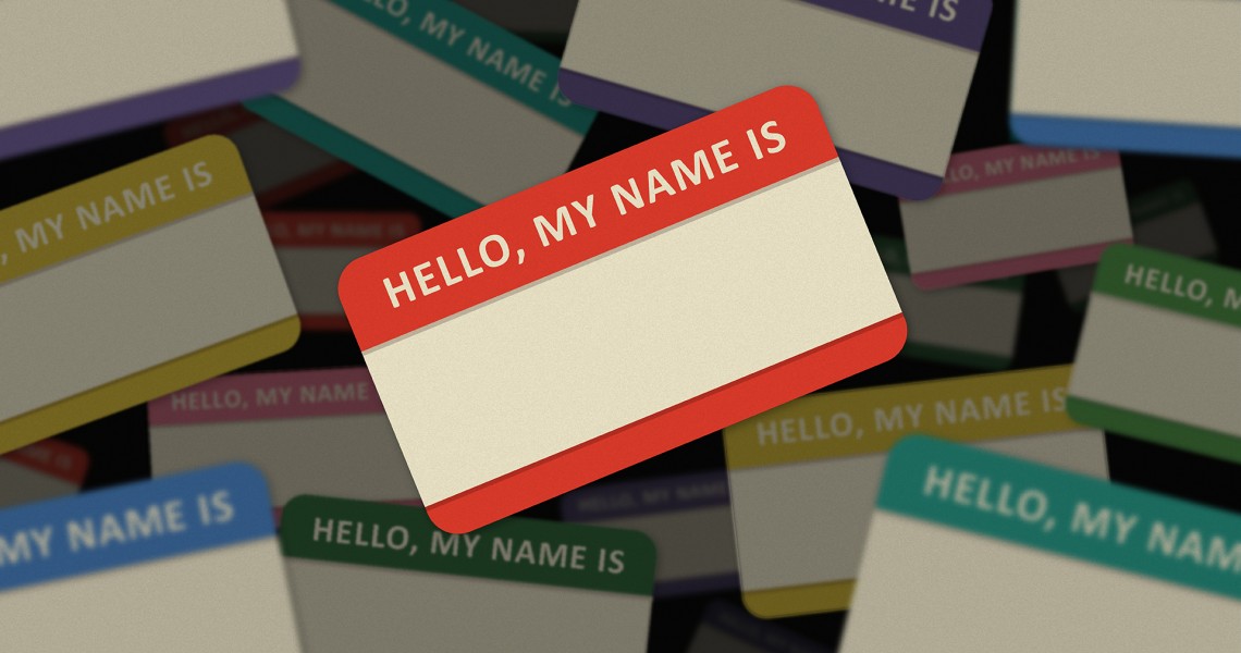
This truism is fundamental to branding—names elicit emotions such as trust, affection or happiness (Coca-Cola) and awe (Apple). Names like Apple and Pepsi may seem arbitrary, but they are pregnant with suggestion. A name greets the customer before he meets the product, and in the end it is the name that rides off alone into the sunset. So…
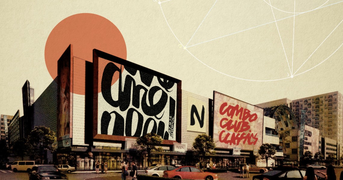
You see it everywhere, absolutely everywhere: rough-and-ready brush lettering or something like it. It’s proudly imperfect and knowingly naive. It’s bold and inkily raw; its voice can be raucous and assertive or tremulous and quivering. It’s on posters, packaging, banners and trademarks of food brands and political movements; on literary book covers, at conferences, and perhaps most of all as messages on social media.
First published in a slightly modified form ‘Branding, to a degree’ in Business Standard, 10 September, in Deep Design, a fortnightly column by Itu Chaudhuri.
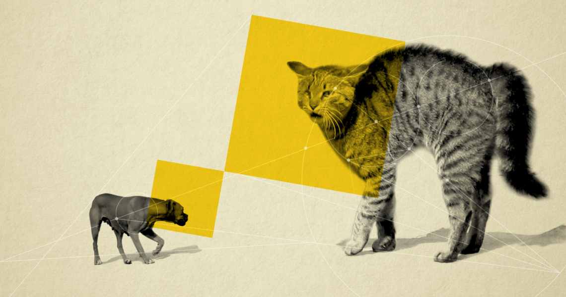
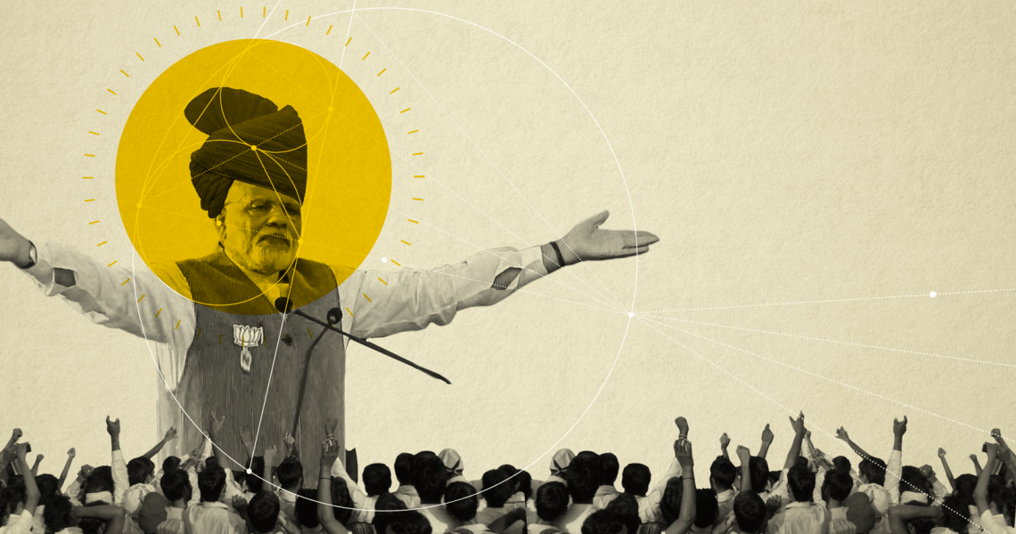
In India, the notion of the brand is both nascent and spreading at a gallop. States, NGOs, government bodies, spiritual leaders, cricket teams, and other once-unlikely entities are starting to receive marketing attention, so the brand is never far behind. It’s the new orthodoxy.