First published in a slightly modified form in Business Standard, 13 August, in Deep Design, a fortnightly column by Itu Chaudhuri.
Everyone loves a new, public logo. It’s a polarising icon, and comments are free. So it is with Olympic logos. Deep Design seeks not to praise or bury them, but to discover the meaning interred into their bones.
Olympic logos support a strong, coherent brand, adapting its unchanging core to a dynamic world. The logos are only one of the brand’s elements, but crucial in a media driven world. The five rings, the flame, torch relays, Olympic villages, and the marathon all effectively emote the Greek myth romanticised by Pierre de Coubertin, the comity of nations and the ideal of human potential.
But Olympic logos have another job. A successful Olympics bid is a high stakes win, a sign of alpha-nationhood. Issues of national identity, overt or subliminal, matter. Equally, the fashions, and the design ideologies of the time leave their print on the logos.
Issues of national identity, the fashions, and the design ideologies of the time leave their print on the logos
So do other nations. Logos seems to follow their predecessor’s example, until one makes a huge change. Much like evolution’s Punctuated Equilibrium hypothesis, periods of stability and periods of rapid change alternate. They thus fall neatly into three ages: Nationhood, Modernism, and the New Age.
Through all these, Deep Design, armed with hindsight, reveals the grand theme: the changing place of the Olympics in our lives and the logo as a sign of adaptation.
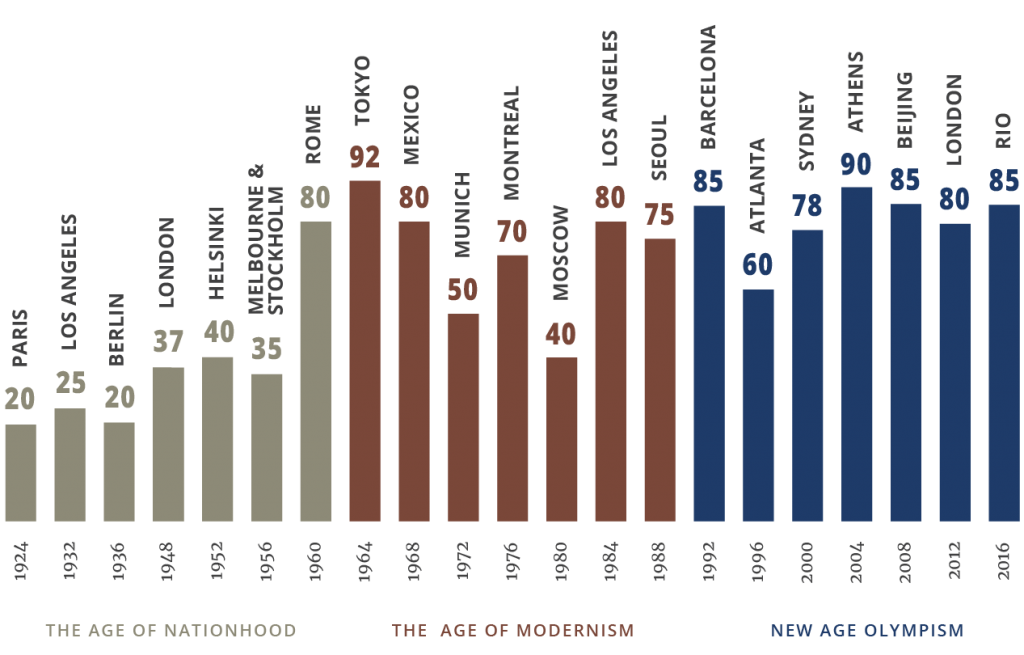
Here’s the parade; only summer games are included.
The Age of Nationhood, logos from 1924 to 1956
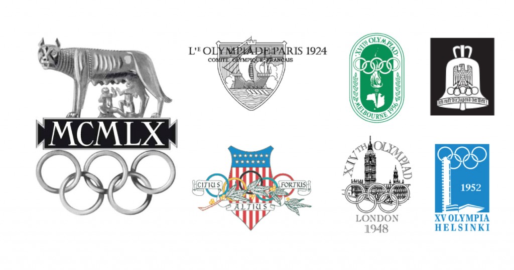
In an age of unprecedented acceleration in design, art, and modernity, Olympic logos are in denial. Sternly bureaucratic and monotone, they impose (quasi) national insignia upon the Games.
Sternly bureaucratic and monotone, they impose (quasi) national insignia upon the Games
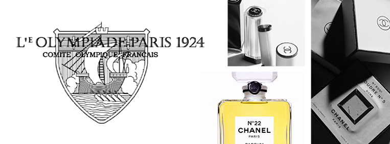
By 1924, Chanel’s timelessly modern fashion and cosmetics are on the street; even the iconic Noº 5 perfume. But art’s capital city chooses its 14th C coat of arms, depicting maritime trade in Paris 1924. Vibrant USA gives us Los Angeles 1932, as if a police department had married an Ivy League college shield, whose Latin motto on scrolls reveal a yearning for antiquity. The land of Bauhaus, instead presents the Third Reich in Berlin 1936, its eagle oppressing the Olympic rings. The London 1948 Games seek to restore calm after WWII, with Westminster’s bureaucratic stiff upper lip. Helsinki 1952 at least shows off new architecture, but Melbourne 1956’s label-like logo reverts to type.
But Rome 1960 represents a thawing. It refers to culture for the first time, picturing the legend of the Rome (not Italy). Its feral snarl is oddly modern and its 3D treatment a tribute to both classical bas-reliefs and Hollywood styling (as in Ben Hur, 1959). The Roman numerals (what else?) bring a smile. Appropriately, it’s on TV for the first time.
The Age of Modernism, logos from 1960-1988
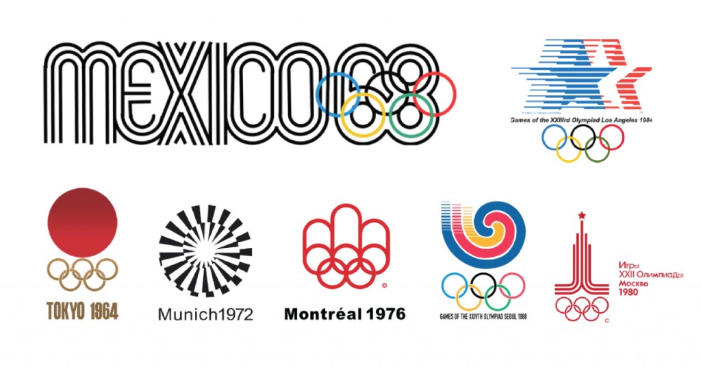
The Tokyo 1964 Rising Sun is a national symbol used as a geometric element. By doing so, it allows the the design to be read as a modernist work, rather than a patriotic symbol from the previous age. It also shows Japan’s confidence in not projecting an overtly cultural identity. This is unlike the other Asian miracle economies of S Korea and China in the coming decades.
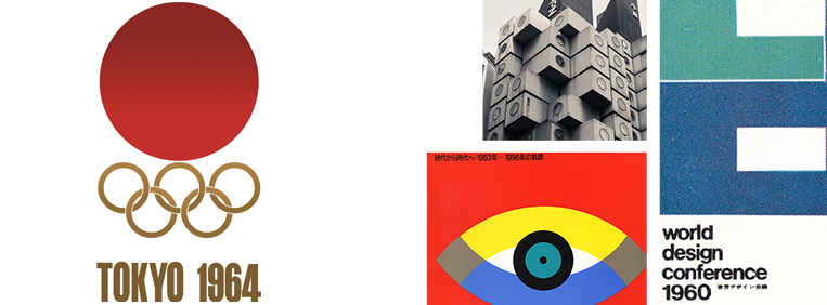
Abruptly, it unleashes Modernist design, as if a dam had burst. It features geometric abstraction and a minimalist ethic that mutes national symbols and history, and subtracts ornament. Also born: the age of corporate identity and design professionalism. From now, designers would be named, and ‘visual systems’ with manuals would become the norm for large projects, giving the practice a technocratic flavour. (Not coincidentally, this is also the age of Milton Glaser, whose ratings of the logos appear at the end of the article; Tokyo 1964 is his gold medalist).
Abruptly, it unleashes Modernist design. It features geometric abstraction and a minimalist ethic that mutes national symbols and history, and subtracts ornament
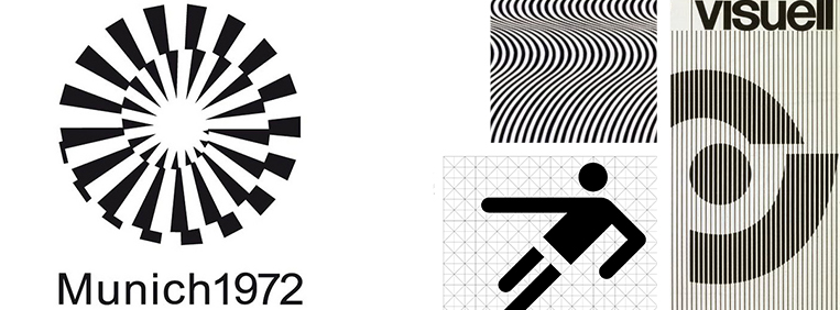
Mexico 1968, a modern classic, is the first Olympic wordmark. Its design grid is formed around the five rings, but also draws on early Mexican art and op-art, joining part of the 1960s zeitgeist. Munich 1972 eliminates the Olympic rings. The severe abstraction of the sun and spiral form may not, though, live up to its idea of the “Cheerful Games”. Montreal 1976 is typical too.
The cold war superpowers’ symbols appear more patriotic than others in this cohort. Moscow 1980’s shot at modernism is topped by its red star, and LA 1984 reprises a familiar theme, with its own stars, only moderately modern, with a classic touch. Star wars, surely?
In this sense Seoul 1988 is an outlier that hands over to the next age, with a vibrant, but modern depiction of a Taoist cosmology, a universe from which creation springs.
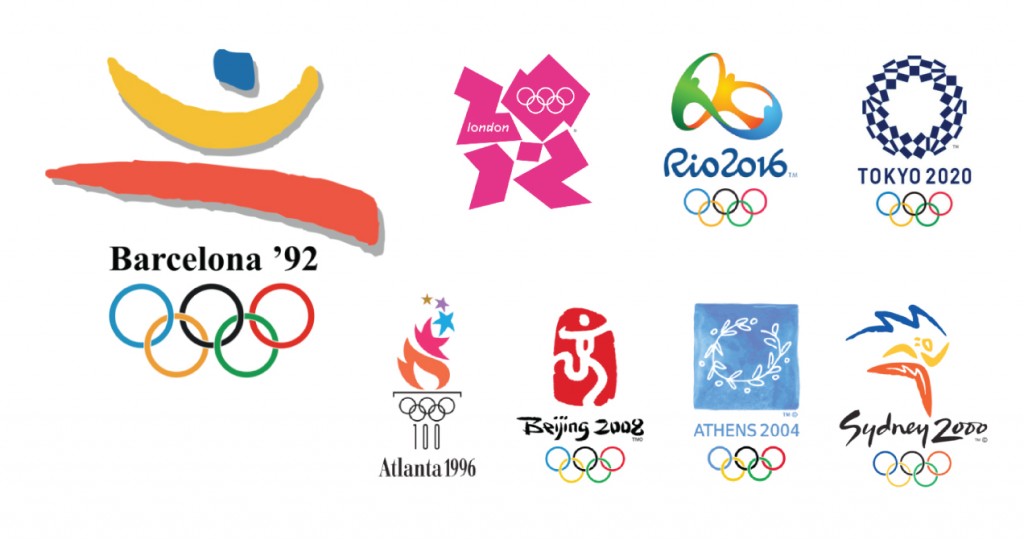
New Age Olympism, logos from 1992 to 2016
Maybe it was the tearing down of the Berlin Wall, the collapse of the Soviet Union, and the fade of the cold war that caused this change. But Deep Design, remembering that even causes have causes, is a cautious theoriser, and sticks to what’s observable.
Flowing free forms. human figures and hand drawn art work show a fatigue with modernism’s technological side. Equally, a fatigue with ideals, and a populist desire to bring the Games down from the heights of Mount Olympus, make them human, not godly, to be celebrated, not looked up to. Everyone’s invited.
Desire to bring the Games down from the heights of Mount Olympus, make them human, not godly, to be celebrated, not looked up to. Everyone’s invited
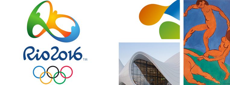
Barcelona 1992 takes the leap. Its designers say that.‘…the symbol could not be made with a …geometric or technological vocabulary.’ Atlanta 1996’s centennial flame, is playful, not prayerful, and the stars even twinkle. Sydney 2000 reduces the Opera House to a sketch, and rides a boomerang. Athens 2004 reintroduces the wreath in the medal ceremony, but with casual flair. Beijing 2008 visually puns the character for ‘culture’ with a human figure. London 2012’s aggressive logo pumps out a megawatt heavy-metal party, painting the Olympics magenta (not part of de Coubertin’s 1912 Olympic palette, which covered the flags of all nations ‘without exception’). In Rio 2016 the comity of nations becomes a sophisticated carnival in an in-vogue 3D style. Does Tokyo 2020 start something new? Look up Deep Design in 2032.
______________________
Milton Glaser, legendary Graphic designer, ranked Olympic logos. Though his marking scheme is not known, Glaser judges their success in professional terms: logos should be understandable, memorable and formalistically attractive.
Sonali
August 18, 2016Wow quite an evolution. Never thought about it.
Hari Sankaran
August 22, 2016Masterful
Yet I cannot help feel that the recollection of an Olympic rarely revolves around its logo, except for the universally remembered rings
Which begs the question of whether the branding of the Olympics has added value to event or the other way around?
Make sense?
Itu Chaudhuri
August 29, 2016Makes sense, Hari. Though I’d say it’s more the case that a logo for a particular Games gains from the five rings, as a useful tool for recognition (but see Munich). But long term, a Games logo only serves for a short period, when it enjoys and connotes its own identity. After that, it’s forgotten, like the Games itself. Only the Olympics are permanent, and their continuity depends not only on the five rings but the rituals that brand it so effectively, as I mention in an early para in the piece.
Mihir
August 22, 2016Fascinating! You have captured the development of the logo through time exceedingly well and the parallels drawn to design and timelines is very educative.
I find this blog one of best places to come to, to read up on design.
My compliments!
Mdan Lal
August 23, 2016For me, it’s really very exiting and developing my ideas in the making of sculptural design. Such a great search by you, I know your excellency in every aspect of life in art. No words to explain my feelings, best wishes. madan lal
Santosh
August 28, 2016Fascinating, Itu. Enjoyed that very much.
Pingback: Nobel, Dylan and the twilight of authority - ICD | Blog
Karin
February 18, 2018Dear Itu, a bit late to the game(s) but I think you made a mistake with depicting Munich’s Logo in its absolute short form. You’ve shown every (at least modern) Logo in a way how they’d been used in official material – and in that case Munich would have always been shown locked with the rings between two border lines.
I also don’t share your opinion on it’s severity going against the motto of cheerful games – keep in mind it usually was shown with its light blue or green background. Sicher was very keen on avoiding dark, somber colors (esp. red and black) in the corporate design, out of his experiences with the Third Reich and he was a deeply humanist person. For him though design didn’t have to be cheerful and cutesy in a way it seemingly has to nowadays (Sydney and Rio, looking at you) to convey a sense of celebration.
And Glaser’s ranking is pretty moot in m opinon, it feels like he’s given just some random marks – must be his age.
Nitasha Basu
March 5, 2018Thanks for your input. It’s interesting indeed.
AnimationVisArts
July 18, 2018The first thing which comes to mind when one thinks of Olympics Symbol is the pentad colored rings. The Olympics symbol meaning and the significance has a historic philosophy behind it.
It was 1912 when Baron Pierre de Coubertin got the idea of polychromatic rings to be used as the logo for the modern Olympics.
The worldwide popular Olympics games are the foremost sports event organizer on an international level, including both summer and winter games.
The logo of the Olympics has a white background with rings of colors blue, black and red in the first
row and of yellow and green in the second row. The pentad colored connected rings symbolize the five continents of the world; Asia, Africa, America, Europe, and Oceania.
The rings are colored with at least one color of the flag of every nation. These colors were chosen to represent every nation that took part in the Olympics games making it an international symbol.
The co-founder of the Olympics Symbol (Logo) has clearly revealed his opinion about his motto behind the multi-colored interlocked rings.
“The Olympic flag has a white background, with five interlaced rings in the center: blue, yellow, black, green and red. The design is symbolic; it represents the five continents of the world united by Olympism while the six colors are those that appear on all the national flags of the world at the present time”.
Since it was the time of World War 1, the designer of the Olympics logo, Baron Pierre de Coubertin wanted a symbol that attained global acceptance and represented peace and solidarity among the nations.
The Olympics is the highest platform for sports competition where sportsmen from all over the world participate. The rings were designed in an interlocking manner in order to represent the unity among the continents.
The Olympics logo has been fortunate in impressing the world with its simplicity and attractiveness universally.